Previously, we have showed you our Night Class’ e-commerce websites and the students’ reflections on the development process of their projects. Now, let us share with you our instructor’s thoughts on the student outputs.
Each project will be evaluated based on two main categories: 1) Design and 2) Functionality.
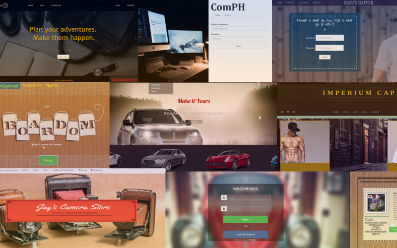
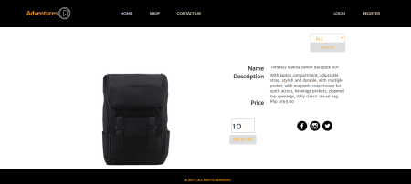
ADVENTURE
Design
- use of white, black, and gold to target a specific group of audience worked well.
- landing/home page has a classy appeal and the banner picture complements the layout.
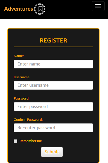
- pages were responsive and adapts properly to changes in window size
Functionality
- able to sort items by category
- had problems with modal implementation during the presentation so the edit item and delete item didn’t work. I am confident though, that these functions are working sans the modal mishap
- could be improved by updating the item stocks whenever customers checkout item/s
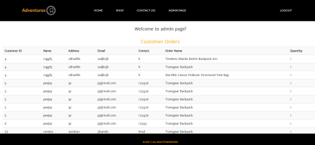
- could be improved if the admin page is not accessible to regular users
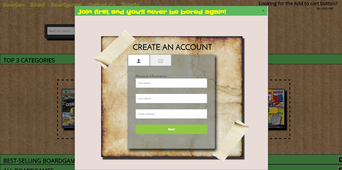
BOARDOM
Design
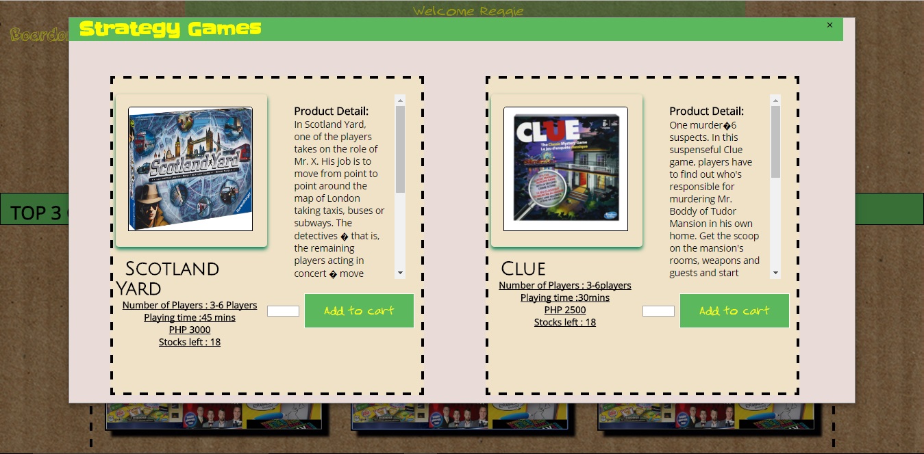
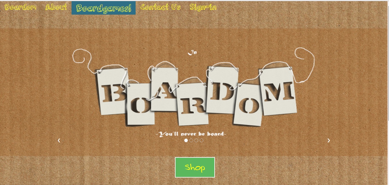
- I admire the fact that the entire layout and design of this website is done in basic css, without using frameworks such as Bootstrap. The downside is: the pages were not responsive
- good use of modals to show different games grouped by category
Functionality
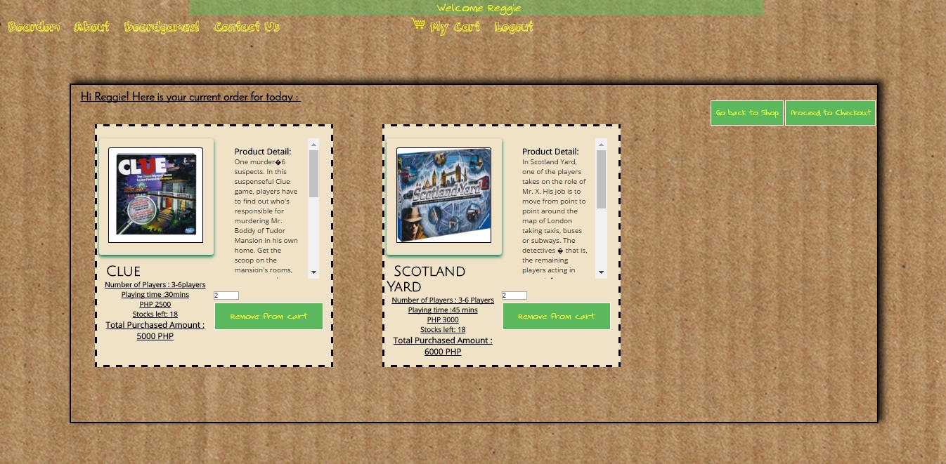
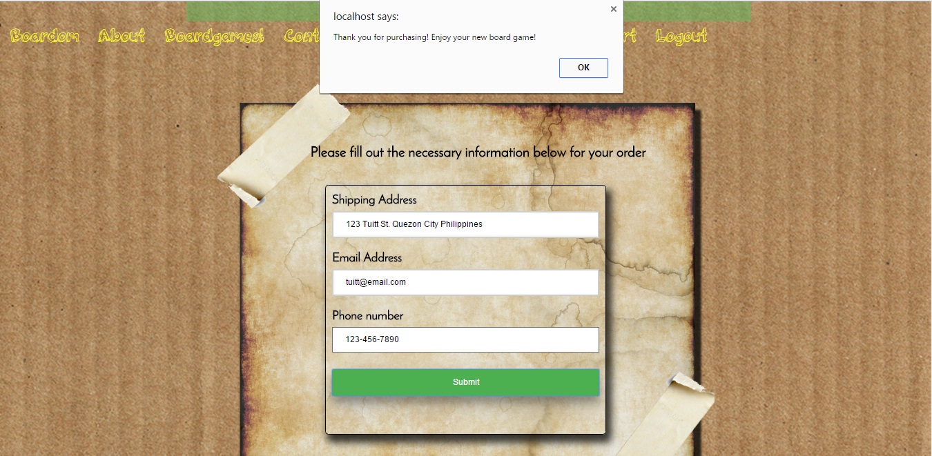
- complete functionality and admin privilege
- stocks were updated every after customer checkout
- admin has access to the list of customer orders
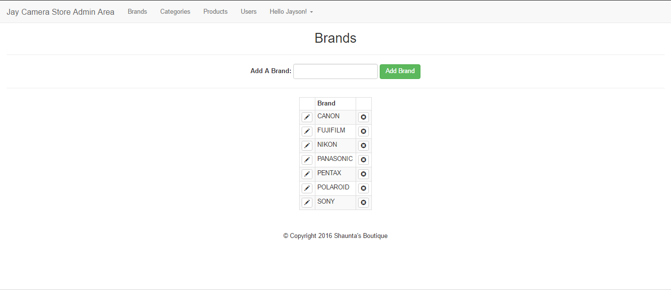
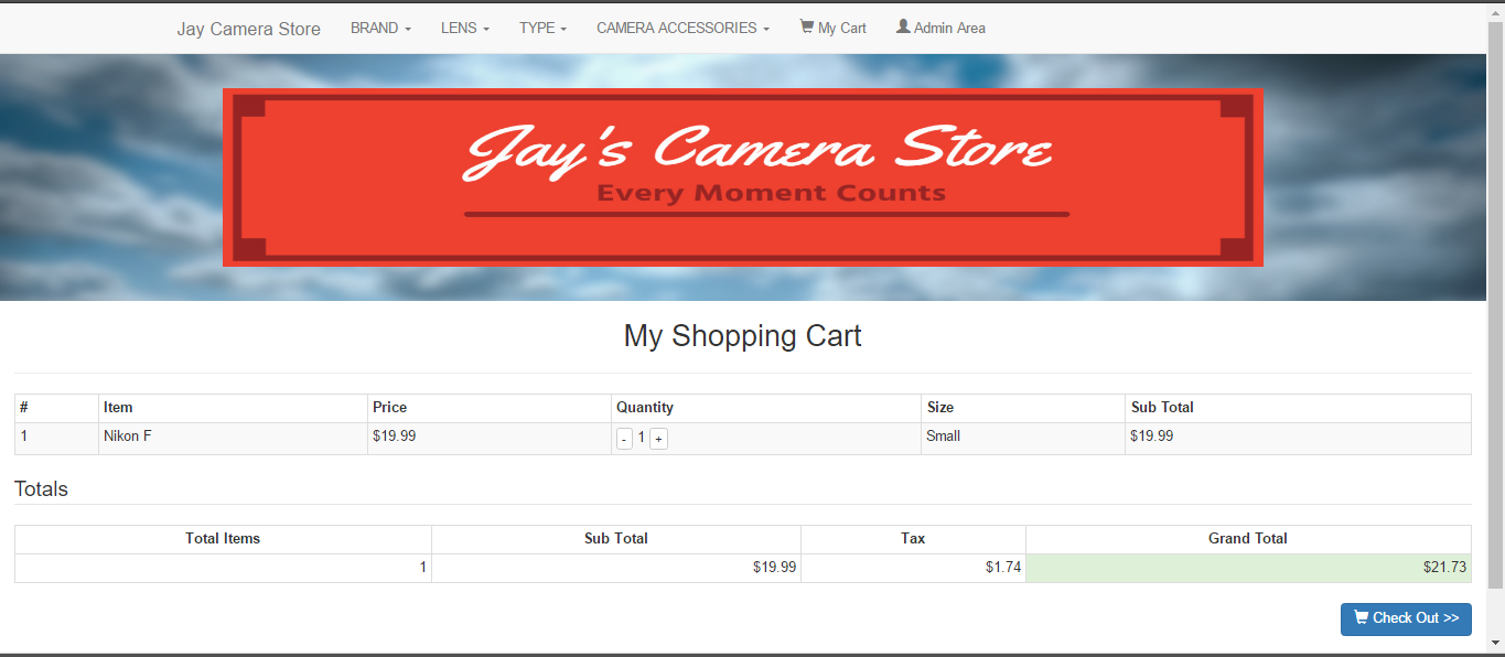
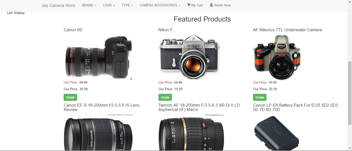
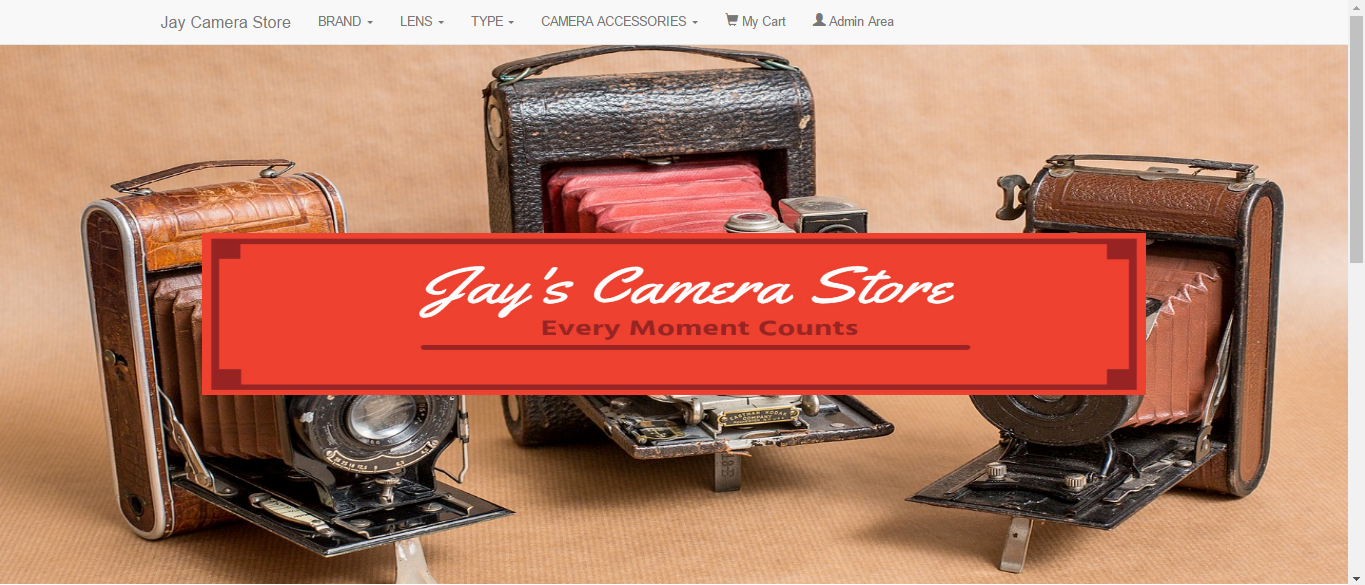
JAY’S CAMERA STORE
Design
- very good design
- pages are fully responsive
- feels like an e-commerce website template
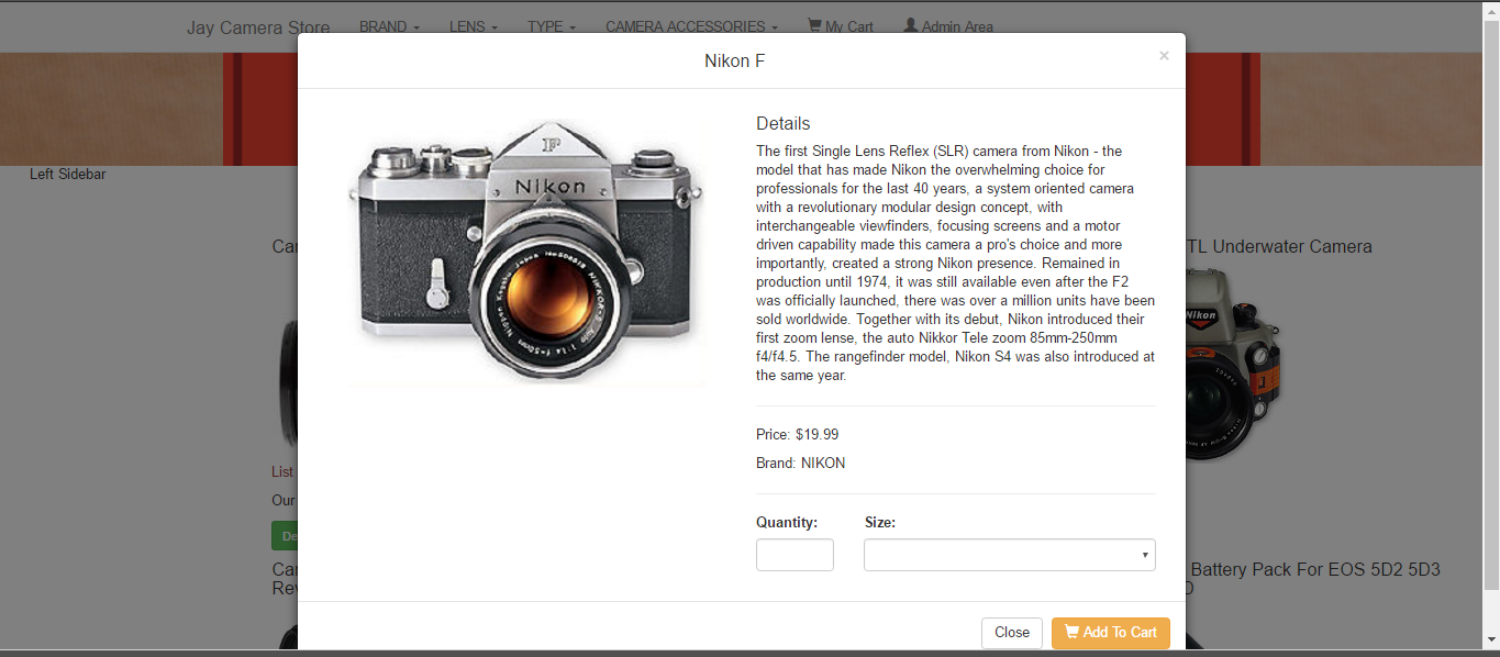
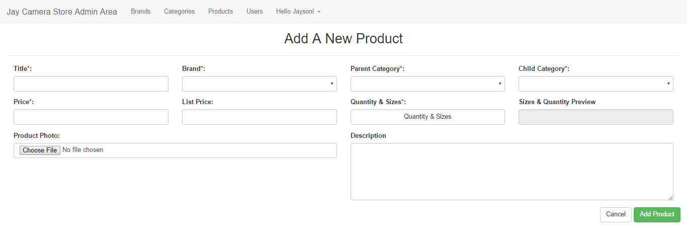
Functionality
- complete functionality and admin privilege
- could be improved by showing number of items left in stock
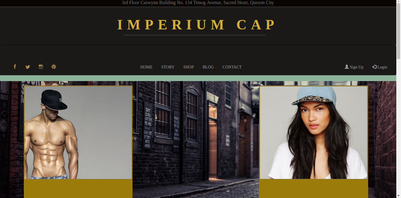
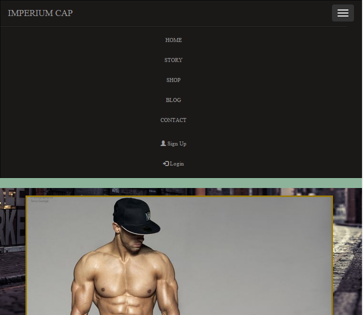
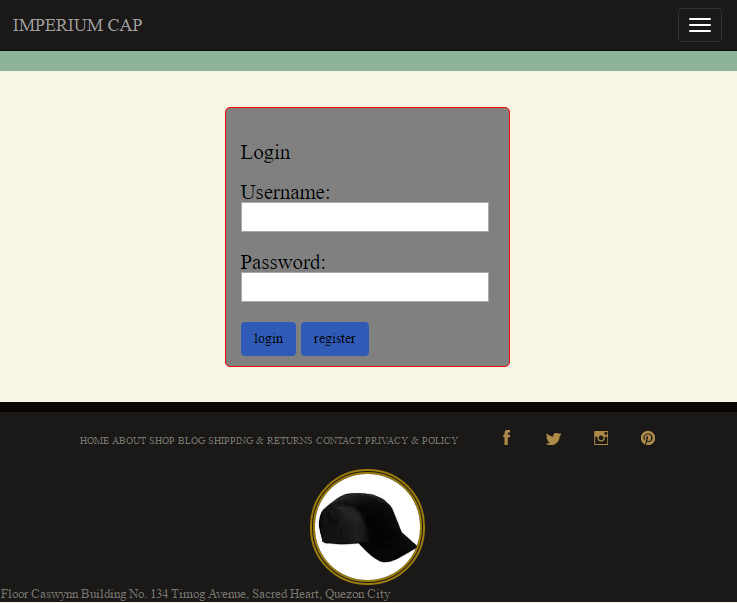
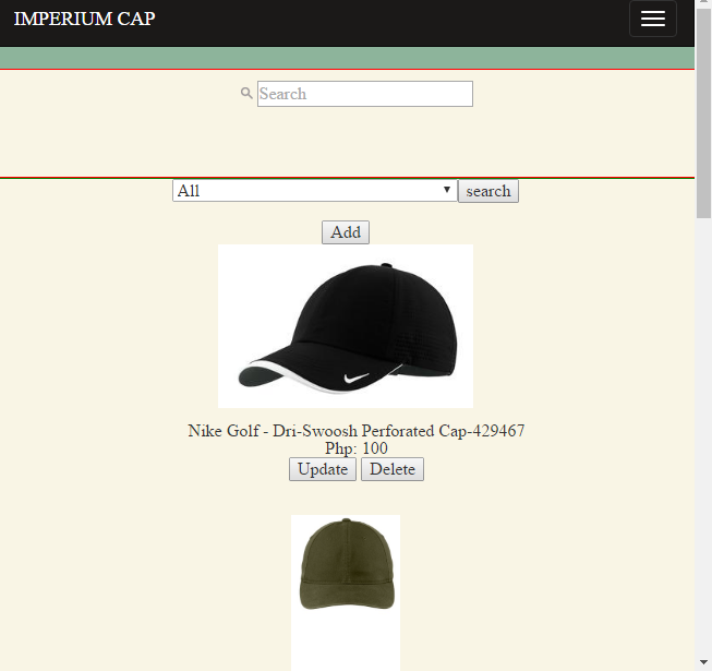
IMPERIUM CAP
Design
- light-colored items page does not match dark-colored landing/home page
- the items page could do better with a bit more design
- navigation bar and images used are responsive
Functionality
- had problem with the log-in verification
- working admin page and admin privilege
- could be improved by updating the database to record all items checked out by customers
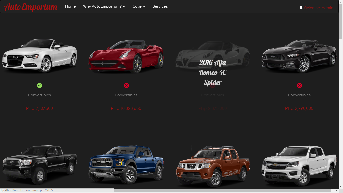
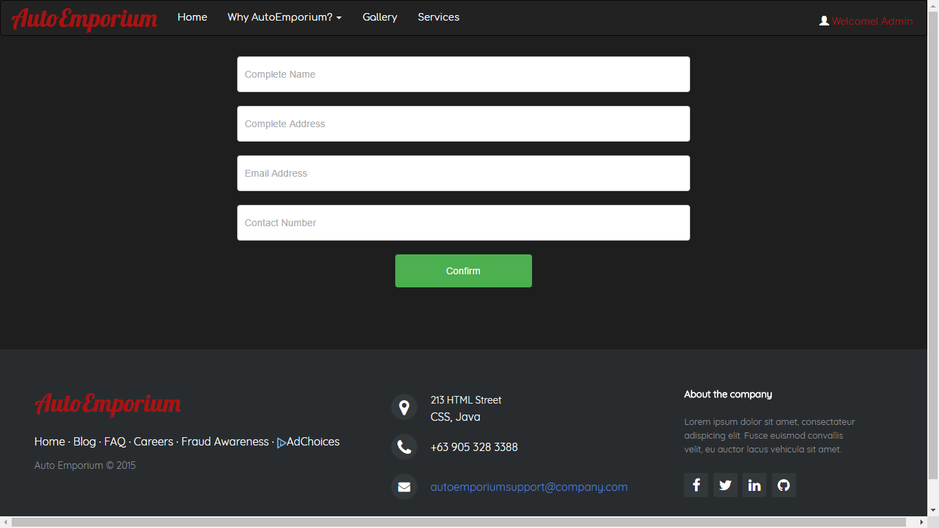
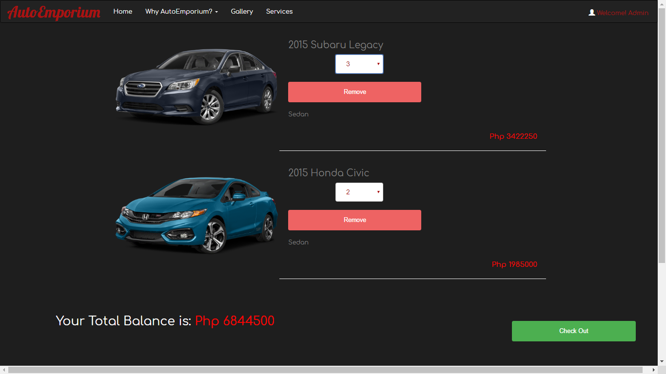
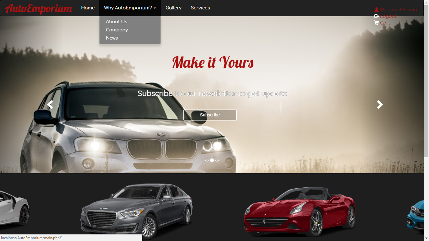
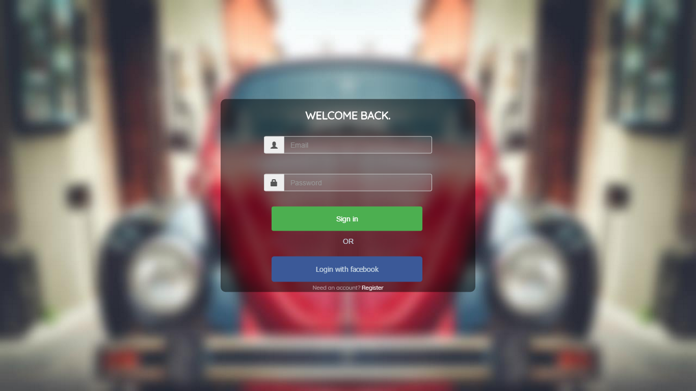
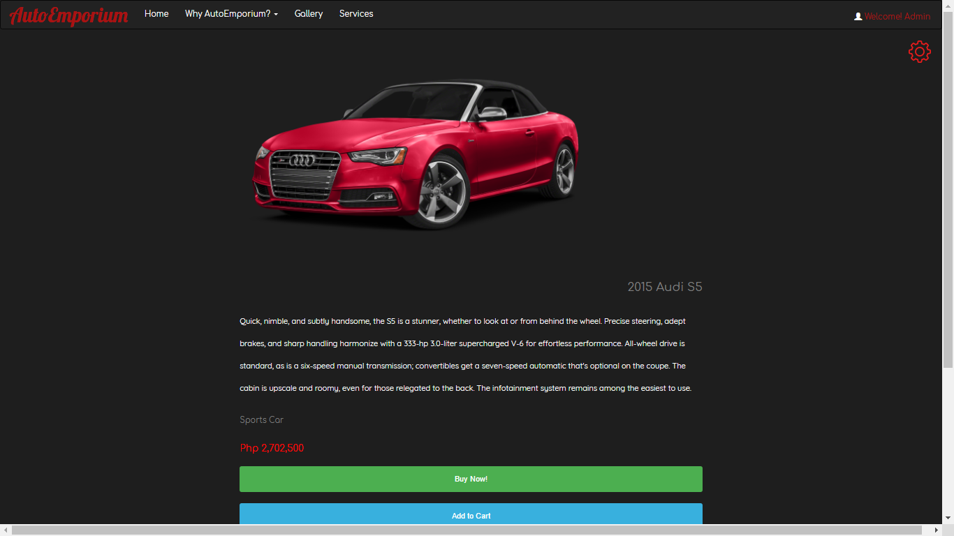
AUTO EMPORIUM
Design
- good color combination
- nice pictures
- the “Buy Now!” and “Add to Cart” buttons can be a little confusing, but other than that, the user interface / user experience on this project is great
Functionality
- able to do basic CRUD functions
- could be improved by updating the database to record all items checked out by customers
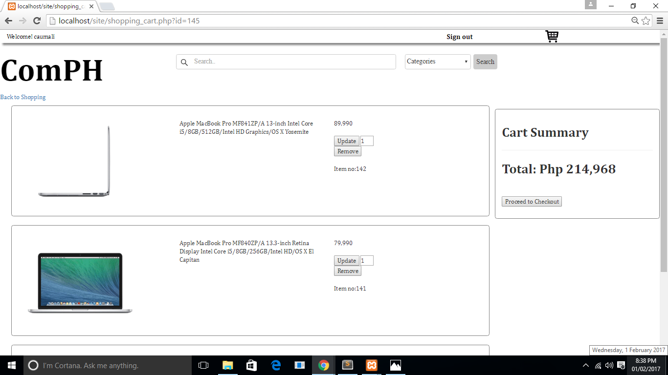
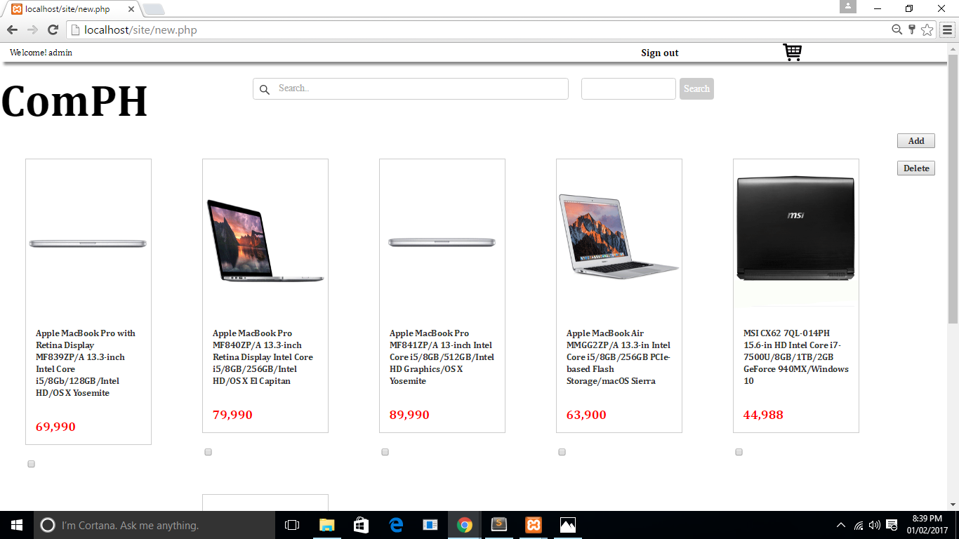
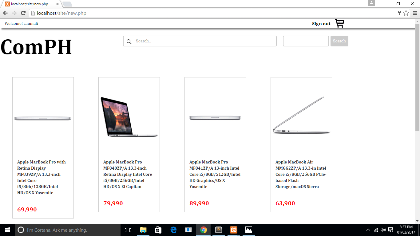
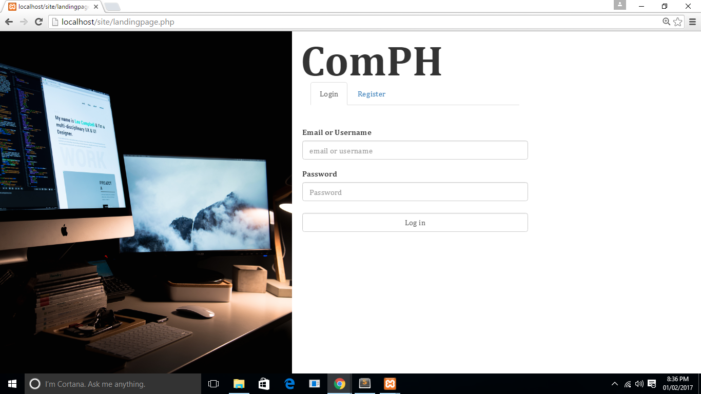
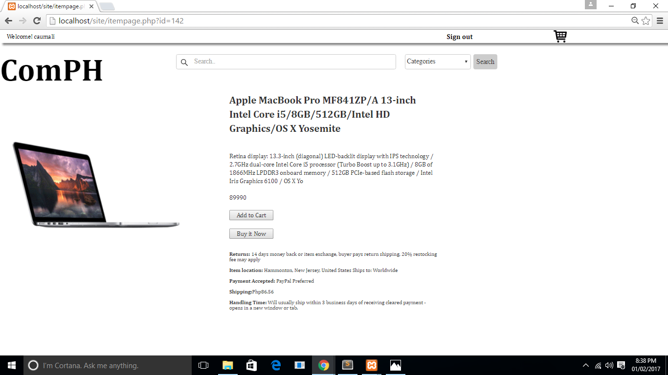
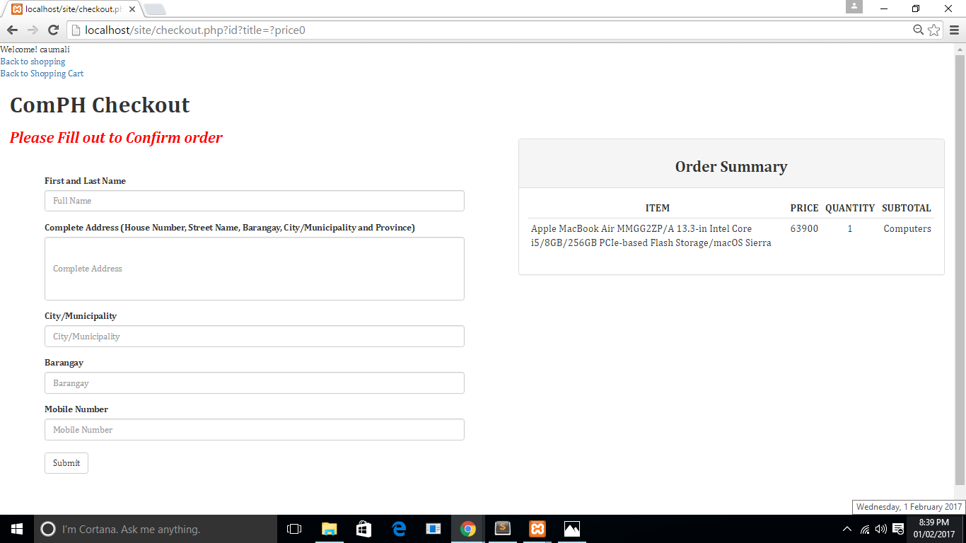
ComPH
Design
- pages were not responsive
- very minimal design and colors
Functionality
- did not use JavaScript or modals
- can delete multiple items at once
- complete CRUD functions
- could be improved by updating the database to record all items checked out by customers
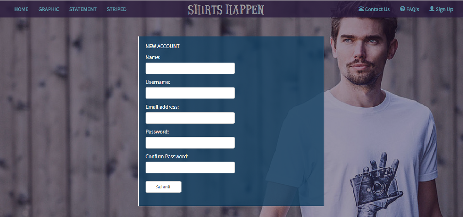
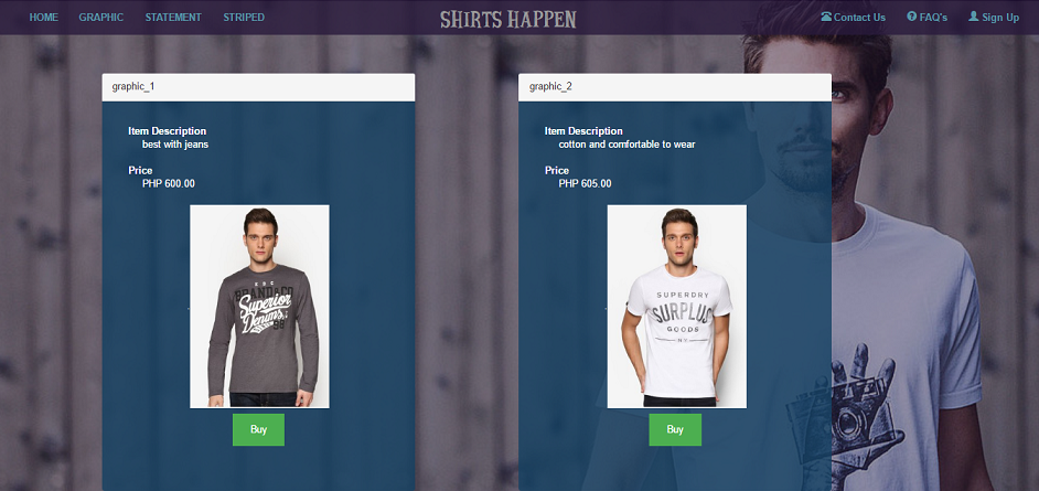
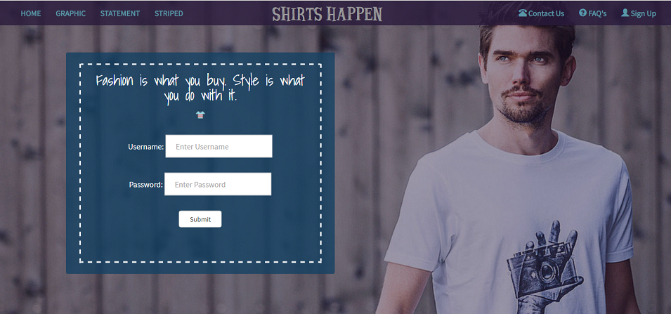
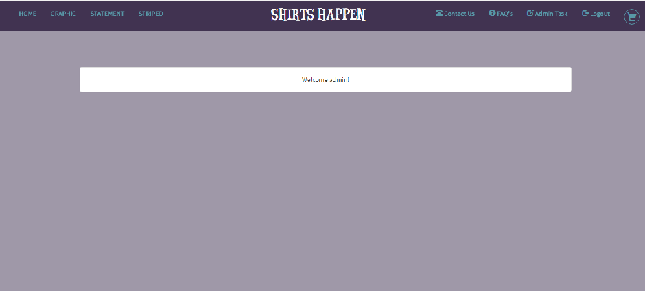
SHIRTS HAPPEN
Design
- partly-responsive design
Functionality
- could be improved if customers can update/change quantity of items in the cart
- could be improved if customers can remove items from cart

